Scout
SmartyPill
BACKGROUND
Scout is Northeastern's student-led design studio. I was part of a team of designers and developers who worked on the brand, identity, and marketing website for SmartyPill, a smart pill dispenser that promotes medication adherance. This project was in collaboration with Roya Paydarfar, Morgan Mapstone, Anna Rychlik, and Anika Jagow.
ROLE
I worked on the UX and UI of smartypill.com, executing both wireframing and high-fidelity designs for handoff for development.
SKILLS & TOOLS
UX/UI
Prototyping
Figma
InVision
TIMELINE
January - April 2020
SmartyPill & Project Goals
Approximately 50% of Americans do not take their medications as prescribed, 69% due to forgetfulness.
When we first met with Matt, Thomas, Christian, and Oscar - the team behind SmartyPill - they described their motivation for SmartyPill's founding: watching family members experience memory-loss and, as a result, straying from their medications. It was clear from the beginning that the SmartyPill team were passionate about making a difference in the lives of seniors, their caretakers, and any person who could benefit from having SmartyPill in their lives.
Since the team had only developed a beta-prototype, they approached us with a variety of design needs. After throwing around some ideas about 3D modeling, app design, and working on the actual screen on the device, we decided that what SmartyPill actually needed were investors, a brand, and a marketing website to showcase the exciting work behind the name.
Branding Process
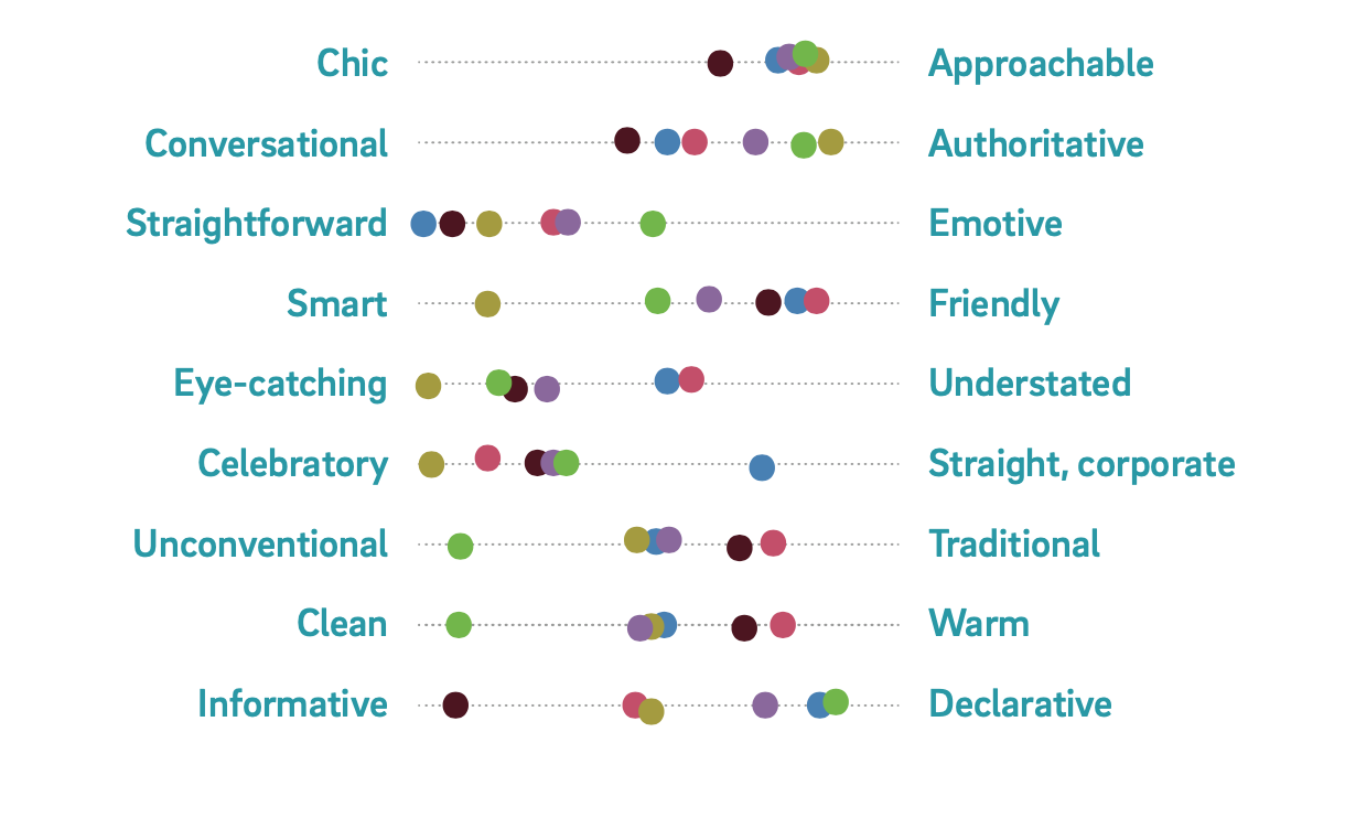
The biggest part of the project was to establish SmartyPill’s brand and identity. My team conducted a series of activities with the SmartyPill team in order to kickstart ideas about what shape it might take visually.
We started by mapping personality levers. We asked stakeholders where they would position Smartypill on a line between two opposed attributes. Based on this map, we began research to create mood boards and start logo sketches. The SP team wanted the brand to feel fun and approachable, but not so youthful that it might ostracize seniors and caretakers.
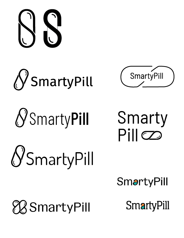
Logo Development
We played around with the ideas of incorporating the capital letterforms "S" and "P" into a pill, placing a round pill somewhere within the wordmark, and just a normal oblong pill.
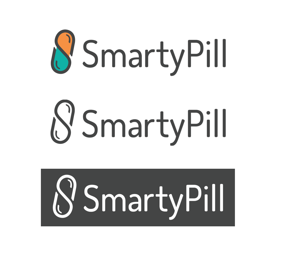
After several rounds of logo directions and iterations, we settled on a word mark beside a pill form. The "S" and "P" forms are still incorporated within the pill, but more subtly.
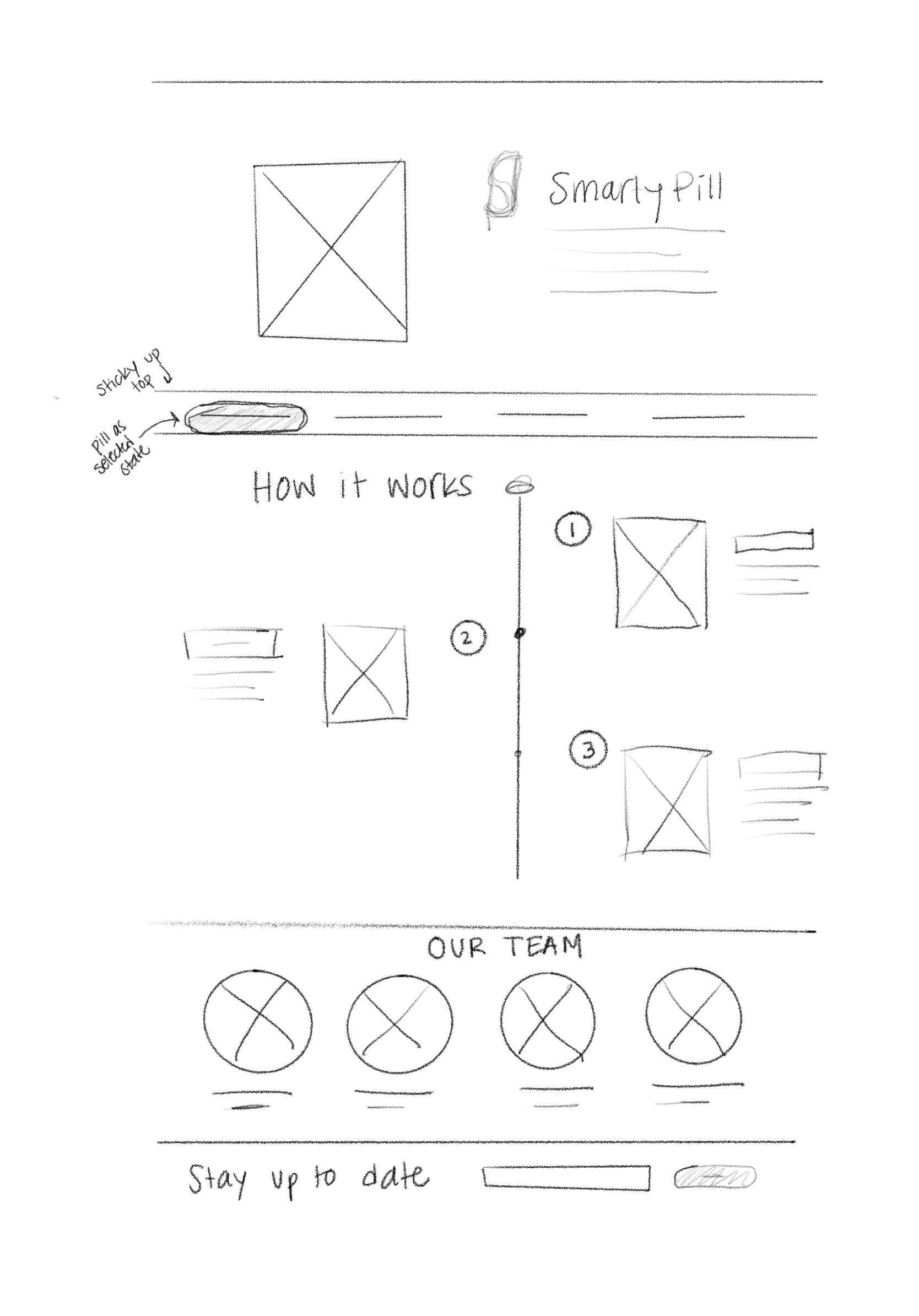
Wireframe Sketches
For the marketing website, we established some goals with the SmartyPill team for what the site aimed to accomplish.
- Showcase the features and functionality of the product
- Illustrate the needs that SmartyPill might fill in a user's life
- Provide information about the founders and their process
I began assembling some wireframe sketches of directions for homepage. I liked the idea of using numbered steps to highlight the process of using SmartyPill, conveying ease of use.
Wireframes
Ultimately, I ended up combining some of the ideas from my sketches into two separate pages. Home, for product-related information, and About, for team and process-related information.
The Home page offers information about the product, what users might expect to regain in their lives as a result of using SmartyPill, and a place for testimonials upon the product's launch. The About page showcases SmartyPill's progress, from ideation to the current prototype.
Another priority was including a number of places where potential users, investors, and other interest parties could input their email to receive updates on the product development process. We included a "Join Now" button in the header, footer, and also a more prominent CTA in the About page.
Bringing SmartyPill to life
When diving into adding color and UI styles, we decided on blues and greens as the primary colors, to convey trust and safety, with orange and yellow as the secondary colors.
We also added these pill patterns throughout the site as a secondary brand element.
The Final Product
We launched the SmartyPill site in May, just in time for the SmartyPill team to enter a pitch competition with their fresh new brand and site. Between handoff for development, we substituted some of the placeholder imagery with illustrations, but below are the final screens. We also made a 3D rendering of their current prototype, and featured it on the hero image and lifestyle image.
Check out the live site at smartypill.com!