Before | After
Interaction Design 2
Mountain Project
BACKGROUND
This was a project completed in Northeastern's Interaction Design: Mobile course. The challenge was to redesign an existing mobile application related to one of our hobbies.
SKILLS & TOOLS
Wireframing, Prototyping, User Interviews, User Testing
Adobe XD
Illustrator
TIMELINE
January - February 2019
The Problem
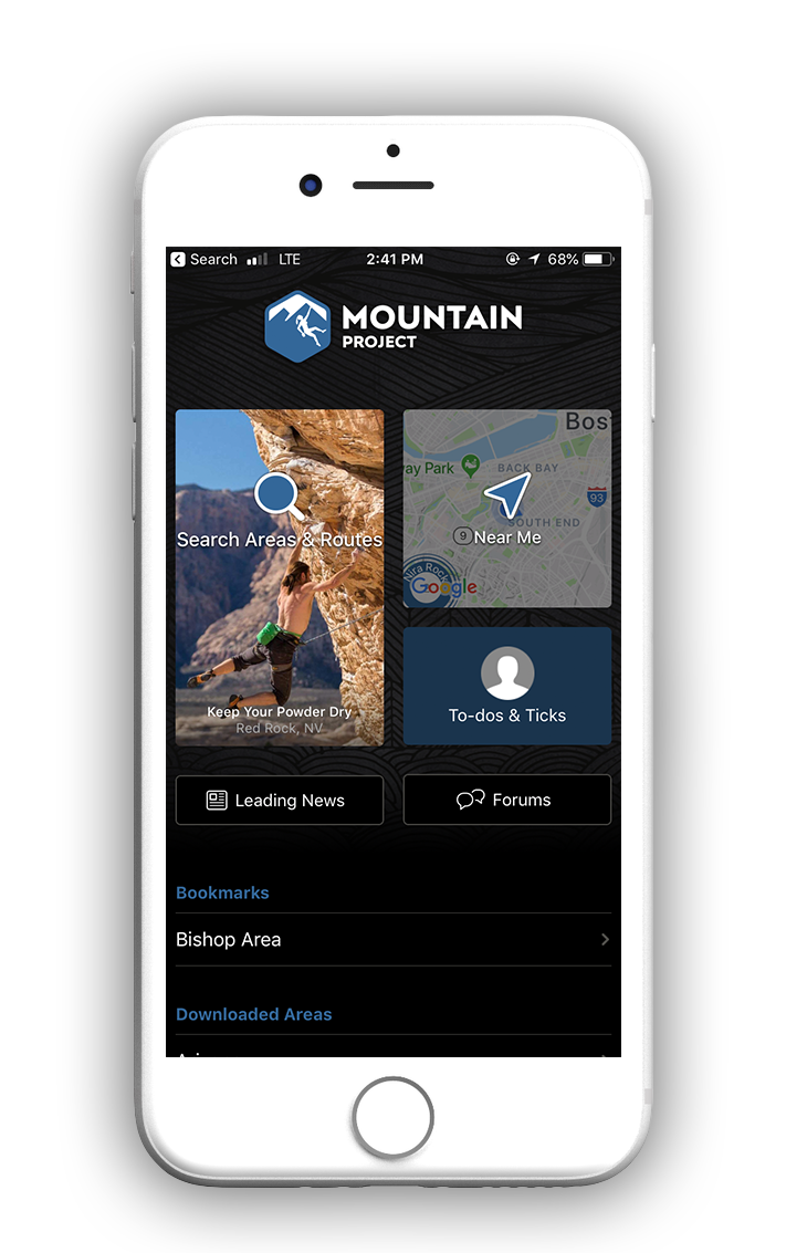
In my Interaction Design 2 class, we were asked to investigate apps that related to our hobbies. The goal was to identify an app that had an inefficient existing user experience and execute a redesign. As a rock climber, I frequently use an app called Mountain Project, which is essentially a mobile guidebook for rock climbs around the United States. It is one of the only applications that has detailed information about climbing routes in all 50 states, yet many climbers find it difficult to use due to the clunky interface and often cyclical interaction flows. As a favor to myself and my fellow climbers, I decided to tackle the redesign of Mountain Project.
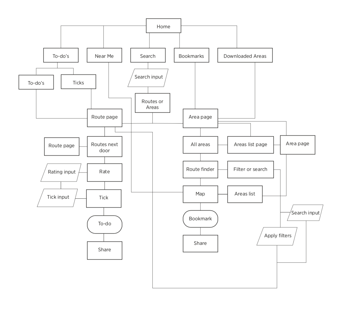
Existing User Flow
Below is the current user flow of Mountain Project. I mainly sought to integrate a "search near me" function, and update the circular nature of the flow. Additionally, there is no bottom navigation, which makes it difficult to switch between pages without endlessly hitting the back arrow.
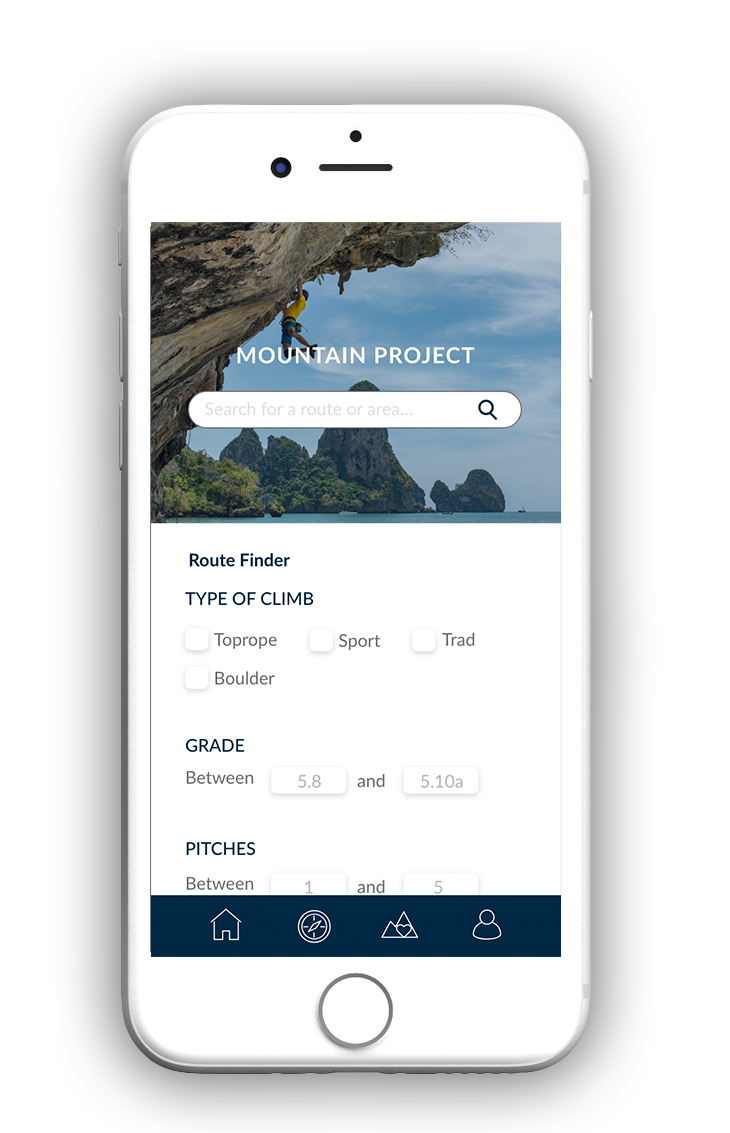
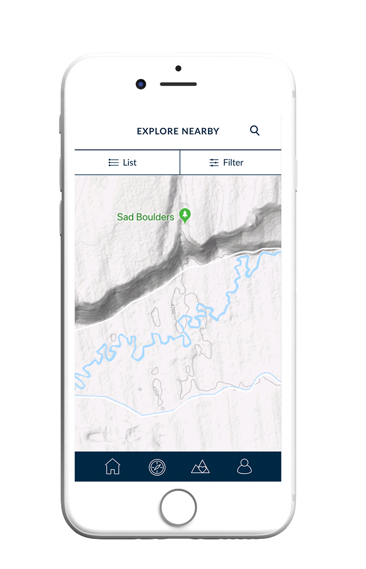
Climbers often look for local places to climb that fit their current level of ability and preferred method of climbing (bouldering, ropes, ice, etc.). However, in the current flow, you have to either first search for a named area/route or use the map to find it. Often the names of climbing areas and routes are made up, sometimes with no relation to the actual environment or geographic area, so it's hard to know what you're looking for if you are new to climbing.
I wanted my design to serve both new and experienced climbers. For beginners - by providing a straightforward way to find climbs without needing to know names or areas, and for experts - allowing them to better organize their favorite routes.
Inital Wireframing
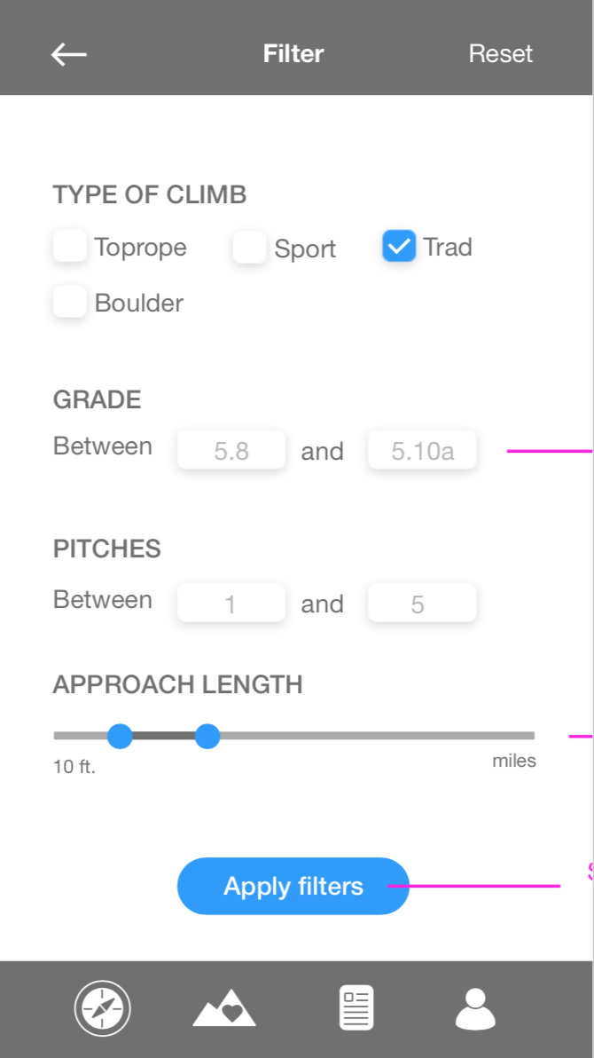
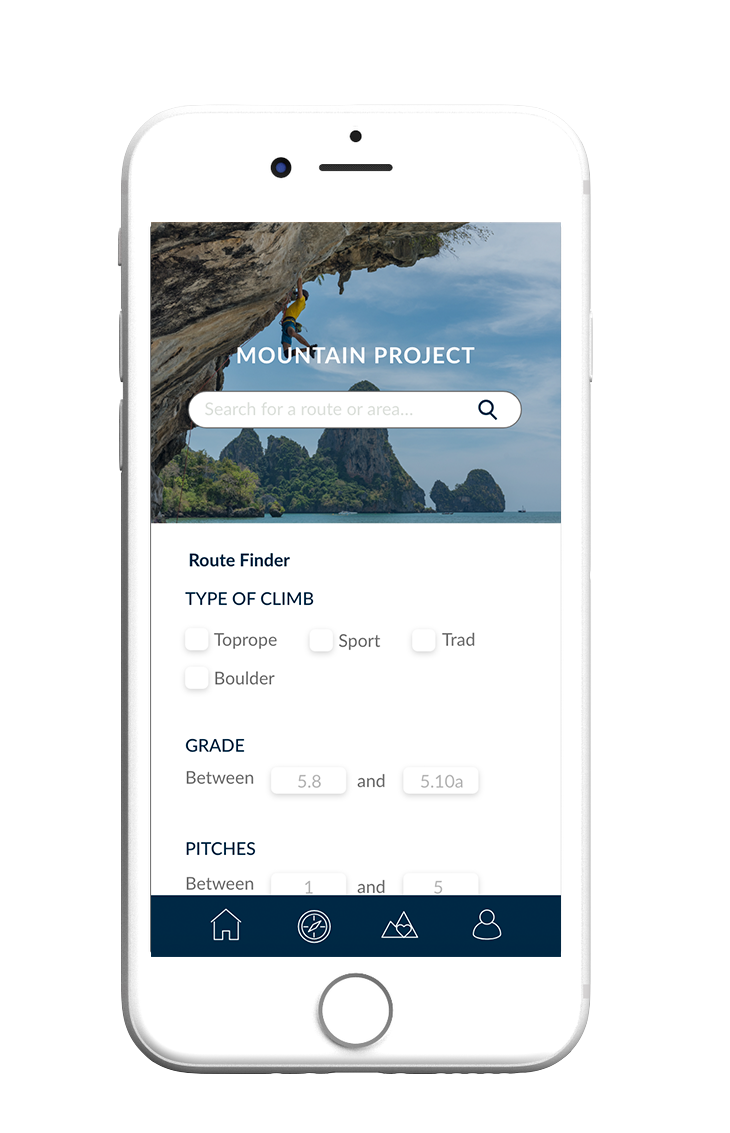
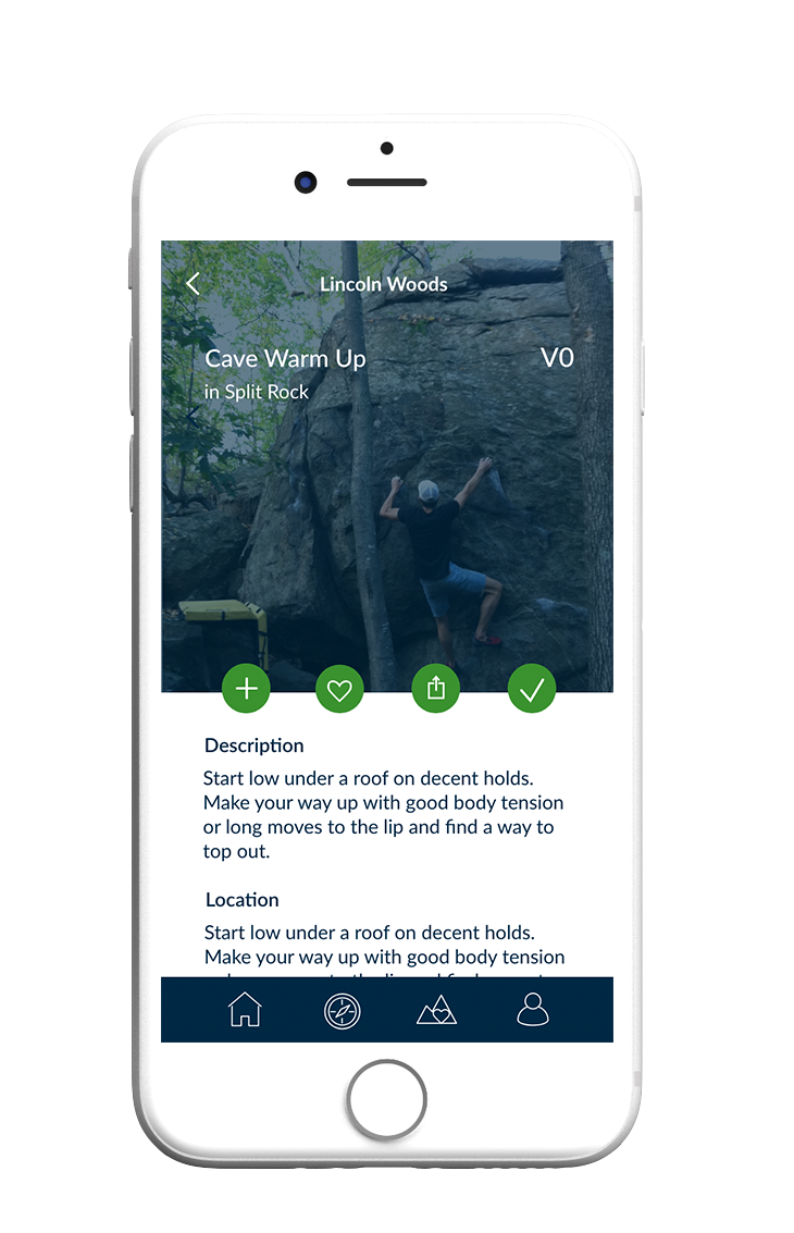
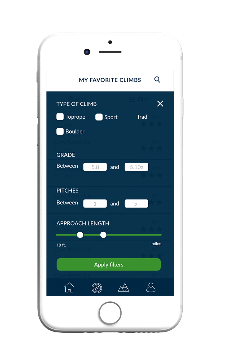
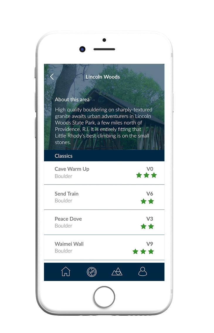
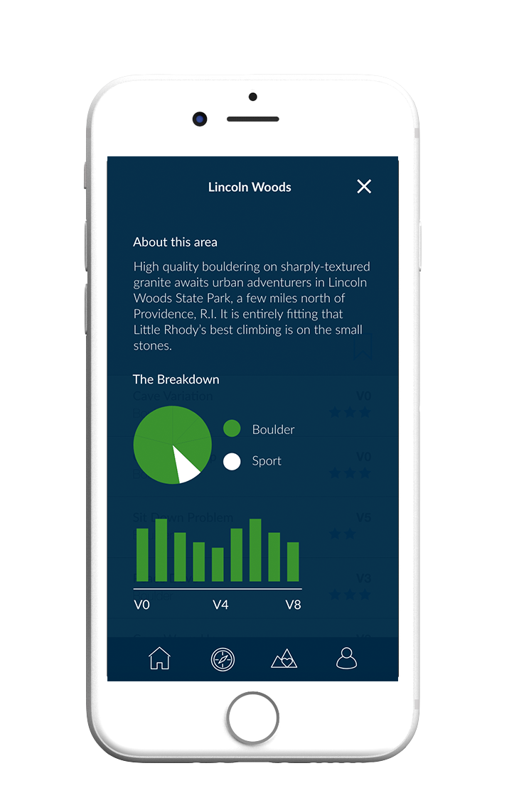
I began my wireframing process by thinking about keeping all the essential functions of the application close at hand. Navigation was a large issue in the existing interface, so I chose to add a bottom navigation bar for easy transitions between screens. I also added an updated filtering option for the type of climb which included approach length (time it takes to get to a certain climb), according to some user research I did. I chose to keep the list view of the climbs the same, as I thought it was the most effective way to display climb information. I used Adobe XD to assemble the screens below.
Visual Design
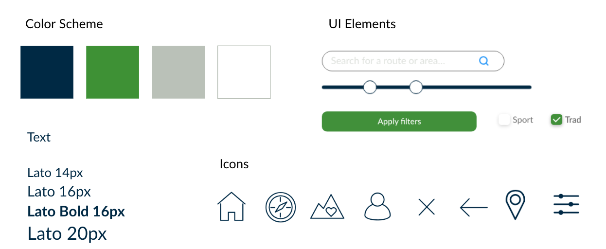
When thinking about visual design, I chose to stick with the sans-serif and nature-inspired palette that Mountain Project already uses, but I added a pop of green as a secondary color. I kept the icons simple and line-based.
User Testing
To get feedback on my prototype, I conducted in-person, moderated user testing both with my classmates and also the population that uses Mountain project regularly. It was interesting testing with two different user groups, as my classmates who are not familiar with rock climbing pointed out some points of confusion that I may have missed.
I asked both groups to search for a climb, filter for a climb, and get to a climb page. After testing, I decided to go forward with some revisions.
- No need for the bookmark feature on the climb page - could be integrated elsewhere
- Map on the homepage is confusing
- Need an easy way to toggle between list and map view
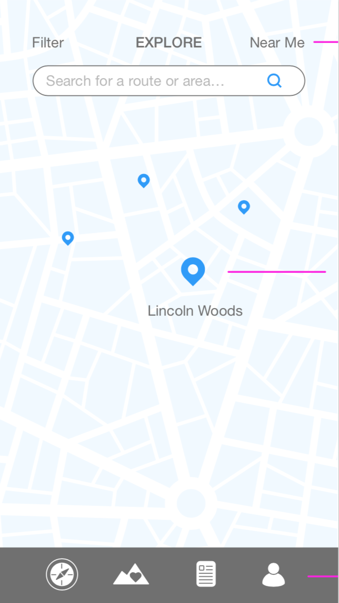
The Prototype
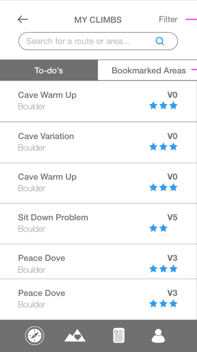
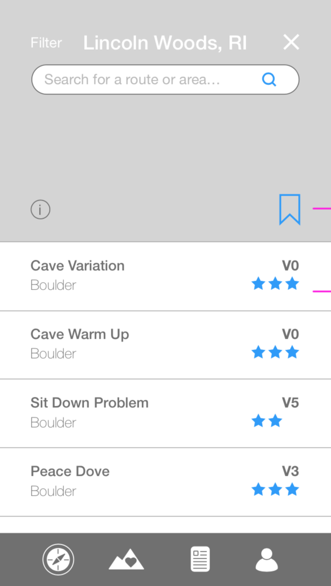
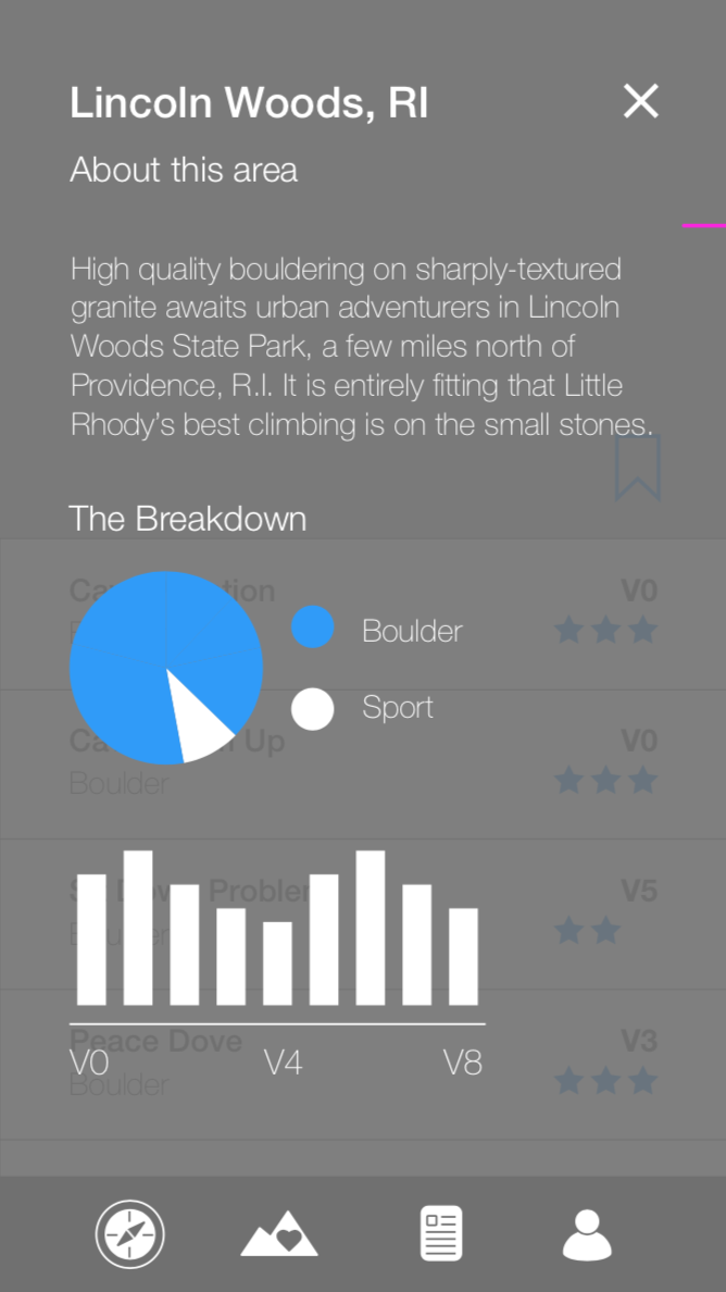
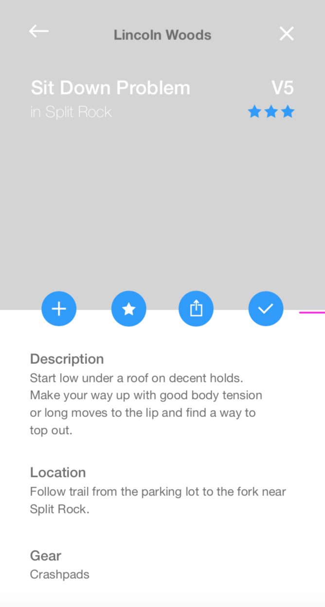
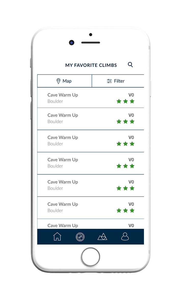
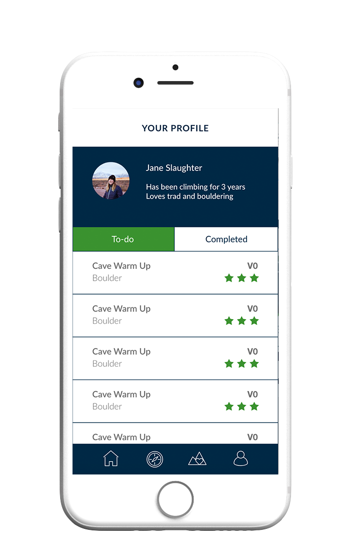
In the final prototype, I adjusted the home screen to be a filter and search page rather than a map. For the explore pages and the favorite climbs page, I added a map and list view for ease of location visualization. The favorite climbs feature can be used to save climbs that aren't necessarily to-do's or completed, just favorites. This solved for the disorganization of the saved routes page on the original Mountain Project interface. Finally, I designed the profile page to contain personal climbing history, to-do's and completed climbs.
Prototype Demo
Below is a video demonstrating my final prototype. This was my first time using and prototyping within Adobe XD and also my first time creating an entire UI for a mobile app. I learned about mobile interface guidelines and how mobile design differs from desktop. Overall, this was a very fun project which merged my two passions, climbing and design.